
YouTube Music
Filling in the gaps by adding new features

YouTube Music
YouTube Music
Filling in the gaps by designing new features
Filling in the gaps by designing new features
UX/UI DESIGN
UX/UI DESIGN
UX/UI DESIGN
MOBILE APP
MOBILE APP
MOBILE APP
REDESIGN
REDESIGN
REDESIGN
FEATURES
FEATURES
FEATURES

ROLE
ROLE
ROLE
UX/UI Designer
UX/UI Designer
Lead researcher and UI designer overseeing project from start to end
Lead researcher and UI designer overseeing project from start to end
TOOLS
TOOLS
TOOLS
Figma, Figjam, Discord, OBS Studio
Figma, Figjam, Discord, OBS Studio
Utilized various tools for research, design, user flows, and interview sessions
Utilized various tools for research, design, user flows, and interview sessions
DURATION
DURATION
DURATION
70+ hours
70+ hours
Features were successfully added, tested, and iterated for final design
Features were successfully added, tested, and iterated for final design
Here's the stitch
Here's the stitch
Here's the stitch
For this project, I focused on uncovering user painpoints within YouTube Music (YTM) —one of the leading music streaming platforms. As an active user myself, I wanted to explore the issues current listeners have and design new features that would serve as the most impactful solution. The goal was to design the right solutions aimed at increasing customer retention and engagement by addressing these gaps.
For this project, I focused on uncovering user painpoints within YouTube Music (YTM) —one of the leading music streaming platforms. As an active user myself, I wanted to explore the issues current listeners have and design new features that would serve as the most impactful solution. The goal was to design the right solutions aimed at increasing customer retention and engagement by addressing these gaps.
For this project, I focused on uncovering user painpoints within YouTube Music (YTM) —one of the leading music streaming platforms. As an active user myself, I wanted to explore the issues current listeners have and design new features that would serve as the most impactful solution. The goal was to design the right solutions aimed at increasing customer retention and engagement by addressing these gaps.
Let's begin our comparison research
Let's begin our comparison research
Let's begin our comparison research
Understanding current trends: Spotify VS YTM
Understanding current trends: Spotify VS YTM
Understanding current trends: Spotify VS YTM
To kick off my research, I had to uncover what features and benefits other platforms had in comparison to YTM. There is a general consensus that music platforms should be able to do two things: play and save songs. Yet, what makes people choose one over the other?
Questions to guide research:
What issues are current users having with YTM?
Why don't nonusers turnover to YTM?
What are the most used and favorite features on each platform?
Is is possible that the price points is what deters users away?
What are the shared user objectives and intentions when using the platform?
Most important takeaways
Most important takeaways
Spotify offers comprehensive playlist making tools and a variety other other services (e.g.podcasts) that attract users
Spotify offers comprehensive playlist making tools and a variety other other services (e.g.podcasts) that attract users
Spotify offers comprehensive playlist making tools and a variety other other services (e.g.podcasts) that attract users
YTM currently lacks basic functionalities and customizations capabilities that make it harder for users to search for their favorite songs and create playlists
YTM currently lacks basic functionalities and customizations capabilities that make it harder for users to search for their favorite songs and create playlists
YTM currently lacks basic functionalities and customizations capabilities that make it harder for users to search for their favorite songs and create playlists
YTM's audio quality can be a bit finicky and inconsistent, making it a less desirable platform for audiophiles to use
YTM's audio quality can be a bit finicky and inconsistent, making it a less desirable platform for audiophiles to use
YTM's audio quality can be a bit finicky and inconsistent, making it a less desirable platform for audiophiles to use
To kick off my research, I had to uncover what features and benefits other platforms had in comparison to YTM. There is a general consensus that music platforms should be able to do two things: play and save songs. Yet, what makes people choose one over the other?
Questions to guide research:
What issues are current users having with YTM?
Why don't nonusers turnover to YTM?
What are the most used and favorite features on each platform?
Is is possible that the price points is what deters users away?
What are the shared user objectives and intentions when using the platform?
We need to further investigate the reasons behind this
We need to investigate the reasons behind this
We need to further investigate the reasons behind this
Let's see what our interviewees think
Let's see what our interviewees think
Let's see what our interviewees think
Getting to know the User Base
Getting to know the User Base
Getting to know the User Base
Prelimiary research showed that the reason why most users prefer Spotify is because it has more features and customization capabilities. I wanted to validate these observations by conducting some user interviews in order to uncover what real users expect and use on the app.
Prelimiary research showed that the reason why most users prefer Spotify is because it has more features and customization capabilities. I wanted to validate these observations by conducting some user interviews in order to uncover what real users expect and use on the app.
Prelimiary research showed that the reason why most users prefer Spotify is because it has more features and customization capabilities. I wanted to validate these observations by conducting some user interviews in order to uncover what real users expect and use on the app.
Limitations
Limitations
Limitations
The ideal interview pool would have consisted primarily of avid YouTube Music users. However, due to recruitment challenges, I was only able to interview two YTM users, with the remaining participants being Spotify listeners.
The ideal interview pool would have consisted primarily of avid YouTube Music users. However, due to recruitment challenges, I was only able to interview two YTM users, with the remaining participants being Spotify listeners.
The ideal interview pool would have consisted primarily of avid YouTube Music users. However, due to recruitment challenges, I was only able to interview two YTM users, with the remaining participants being Spotify listeners.
My goal was to uncover common frustrations and pain points experienced by both YouTube Music and Spotify users. By comparing insights from both groups, I aimed to identify key gaps between the platforms and develop design solutions that address those differences.
My goal was to uncover common frustrations and pain points experienced by both YouTube Music and Spotify users. By comparing insights from both groups, I aimed to identify key gaps between the platforms and develop design solutions that address those differences.
My goal was to uncover common frustrations and pain points experienced by both YouTube Music and Spotify users. By comparing insights from both groups, I aimed to identify key gaps between the platforms and develop design solutions that address those differences.
Main Insights and Observations
Main Insights and Observations
Main Insights and Observations
Users want to listen to music in the easiest and quickest way possible, valuing simple and clean UI
Interviewees state that their homepage becomes cluttered with unwanted categories at times
All users typically sort their playlists by "most recents" because "its the only good option" available
All users typically select "most recents" or "quickpicks" to listen to music, allowing the algorithm curate a playlist for them
When creating playlists, 4/5 users first "like" a song, then goes back to that specific playlist to organize
YTM users mentioned that their home page sometimes gets filled with uncessesary categories and would like the option to remove or pin items
Key Considerations
Key Considerations
Key Considerations
Users typically sort their music by "most recents" only because it is "the only/best option"
Users typically sort their music by "most recents" only because it is "the only/best option"
Users typically sort their music by "most recents" only because it is "the only/best option"
Sometimes there are unwanted song or playlist reccommendations on homepages that make it feel cluttered
Sometimes there are unwanted song or playlist reccommendations on homepages that make it feel cluttered
Sometimes there are unwanted song or playlist reccommendations on homepages that make it feel cluttered
Users are very loyal to their own platform and would only consider switching if the price plans increased significantly
Users are very loyal to their own platform and would only consider switching if the price plans increased significantly
Users are very loyal to their own platform and would only consider switching if the price plans increased significantly
If it's difficult to win over new users due to their strong loyalty to other platforms, then it's even more important to focus on giving current users everything they need to stay satisfied and engaged
If it's difficult to win over new users due to their strong loyalty to other platforms, then it's even more important to focus on giving current users everything they need to stay satisfied and engaged
If it's difficult to win over new users due to their strong loyalty to other platforms, then it's even more important to focus on giving current users everything they need to stay satisfied and engaged
Now that the foundational research as been completed, its time to synthesize our data
Now that the foundational research as been completed, its time to synthesize our data
Now that the foundational research as been completed, its time to synthesize our data
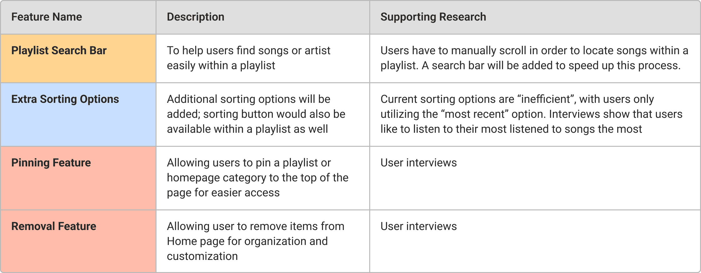
The Features
Features were identified and selected based on insights from user interviews and further supported by secondary research on the most frequently mentioned apps.
Defining the User Flow
I wanted to give testers a good idea of how the features work and for them to form their opinion on whether they'd utilize these features. Flows were designed to follow the typical user experience noted from user interviews.
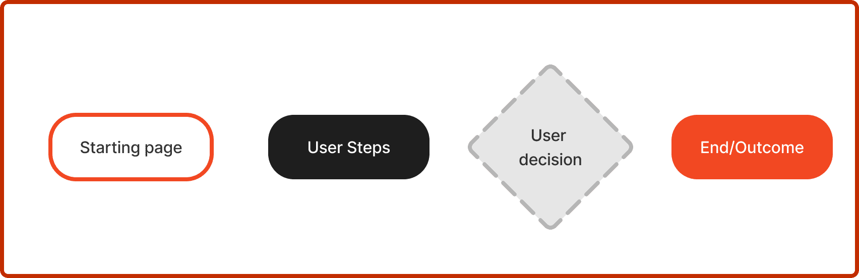
Task Flows Key
Search Bar

Tap image to enlarge
Search bar is typically use when searching for a song within a playlist or a playlist within a library. Users will also have to delete and add songs to playlists to make it a more realistic experience
Extra Sorting Options

Press image to enlarge
Two new sorting types added; users will have to choose the best option they would use the most. I am expecting them to select the ones I added.
Additionally, showcasing song or playlist play times will be added to accommodate the sorting features
Pinning/Removing items

Press image to enlarge
Ability to pin and remove items from the home page added
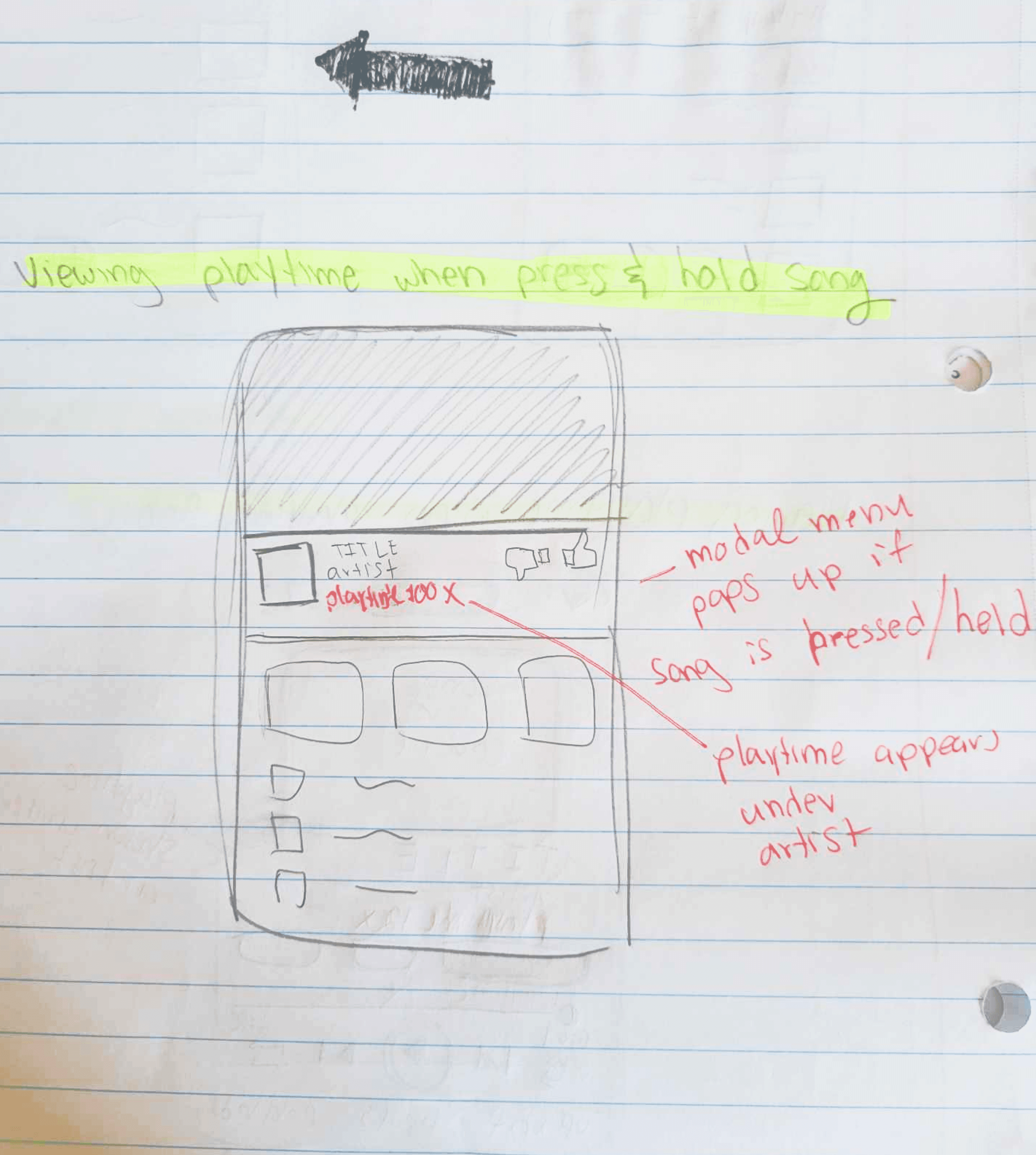
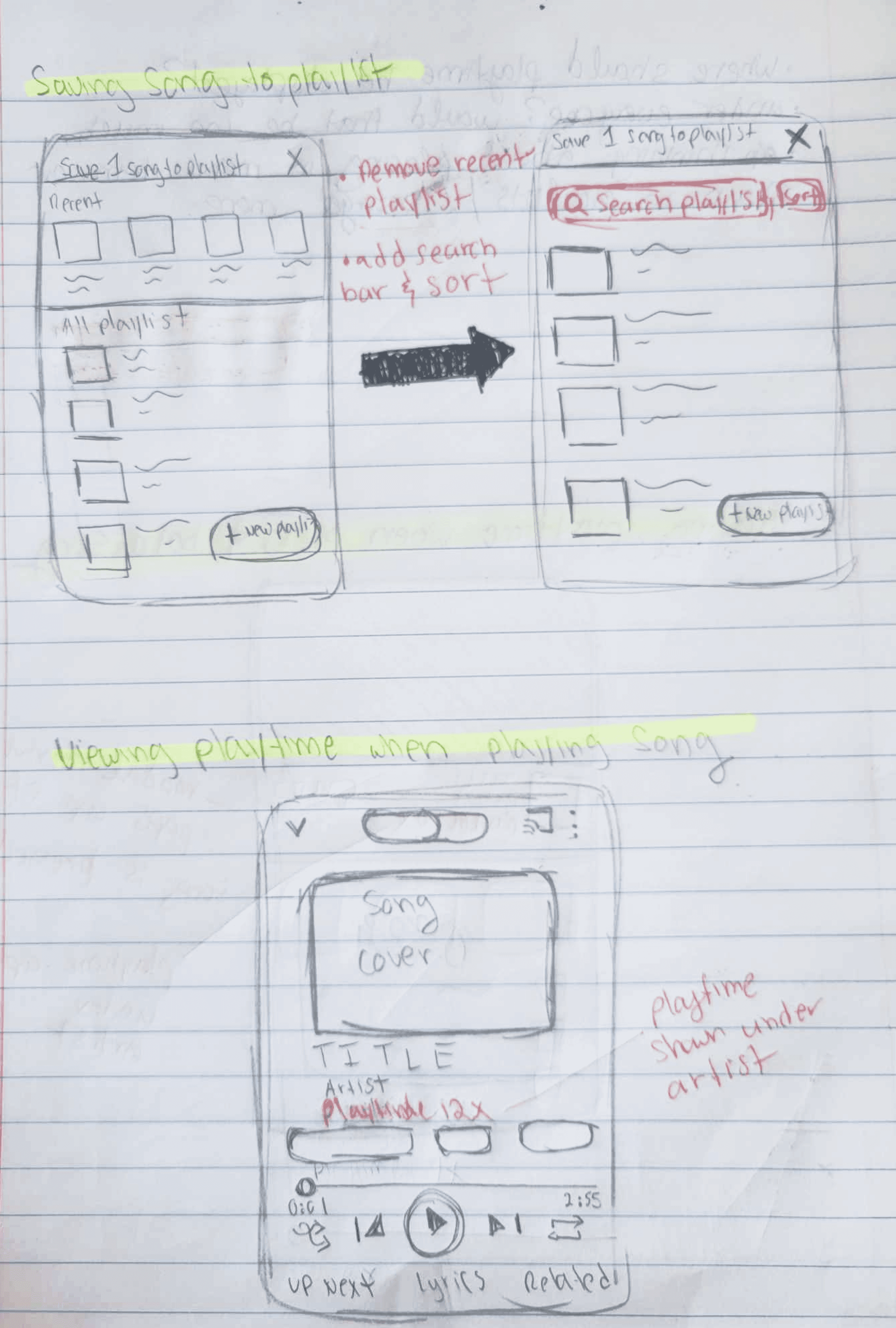
Viewing Play times

Press image to enlarge
Play time indicators were added to provide more information for users
Identifying the issues and creating features
Like with any app, users just want to get to what they’re looking for as quickly as possible. On YouTube Music, the homepage is one of the most commonly used areas—most people tap on the first few songs they see, expecting those to be their most listened to songs, while others go straight to their playlists and pick from there.
What really stood out to me is how users search for music. Right now, YTM doesn’t offer the most helpful features for finding and saving songs easily. So, I came up with four feature ideas that could make this process a lot smoother for everyone
Set up is complete
Let's design
The Features
Features were identified and selected based on insights from user interviews and further supported by secondary research on the most frequently mentioned apps.
Playlist Search Bar
Playlist Search Bar
Playlist Search Bar
YTM users have to manually scroll through playlists in order to find a specific song.
Therefore, a playlist search bar will be added to allow users to locate songs faster and create playlists more efficiently.
YTM users have to manually scroll through playlists in order to find a specific song.
Therefore, a playlist search bar will be added to allow users to locate songs faster and create playlists more efficiently.
YTM users have to manually scroll through playlists in order to find a specific song.
Therefore, a playlist search bar will be added to allow users to locate songs faster and create playlists more efficiently.
Extra Sorting Options
Extra Sorting Options
Extra Sorting Options
Data shows that users use the "most recent" sorting feature the most because it is "the only best option".
Therefore, additional sorting features, such as viewing the most or least played songs within the library or playlist, will be added to give users more flexibility and utility.
Data shows that users use the "most recent" sorting feature the most because it is "the only best option".
Therefore, additional sorting features, such as viewing the most or least played songs within the library or playlist, will be added to give users more flexibility and utility.
Data shows that users use the "most recent" sorting feature the most because it is "the only best option".
Therefore, additional sorting features, such as viewing the most or least played songs within the library or playlist, will be added to give users more flexibility and utility.
Removing/Pining
Removing/Pining
Removing/Pining
Interviewees expressed their frustrations when their home page is cluttered with reccommendations or categories unrelated to their interests.
Therefore, an option to remove unwanted categories or pin favorites will be added to fit user needs.
Interviewees expressed their frustrations when their home page is cluttered with reccommendations or categories unrelated to their interests.
Therefore, an option to remove unwanted categories or pin favorites will be added to fit user needs.
Interviewees expressed their frustrations when their home page is cluttered with reccommendations or categories unrelated to their interests.
Therefore, an option to remove unwanted categories or pin favorites will be added to fit user needs.
Defining the user flow
Defining the user flow
Flows were designed around the main features I planned to add onto the platform and aimed to follow the typical user music listening experience noted from user interviews.
Flows were designed around the main features I planned to add onto the platform and aimed to follow the typical user music listening experience noted from user interviews.
Task Flows Key
Task Flows Key
Search Bar

Press image to enlarge
Search bar is typically use when searching for a song within a playlist or a playlist within a library. Users will also have to delete and add songs to playlists to make it a more realistic experience
Press image to enlarge
Extra Sorting Options
Two new sorting types added; users will have to choose the best option they would use the most. I am expecting them to select the ones I added.
Additionally, showcasing song or playlist play times will be added to accommodate the sorting features
Press image to enlarge
Search Bar
Search bar is typically use when searching for a song within a playlist or a playlist within a library. Users will also have to delete and add songs to playlists to make it a more realistic experience
Press image to enlarge
Pinning/Removing Home Page Items
Ability to pin and remove items from the home page added
Setting up the frames & testing
Hand-drawn low-fidelity sketches were created first, and then translated onto Figma for user testing. I wanted to ensure that the designs and button placements were correctly designed, ensuring no misclicks or confusion.
Wireframing and Testing
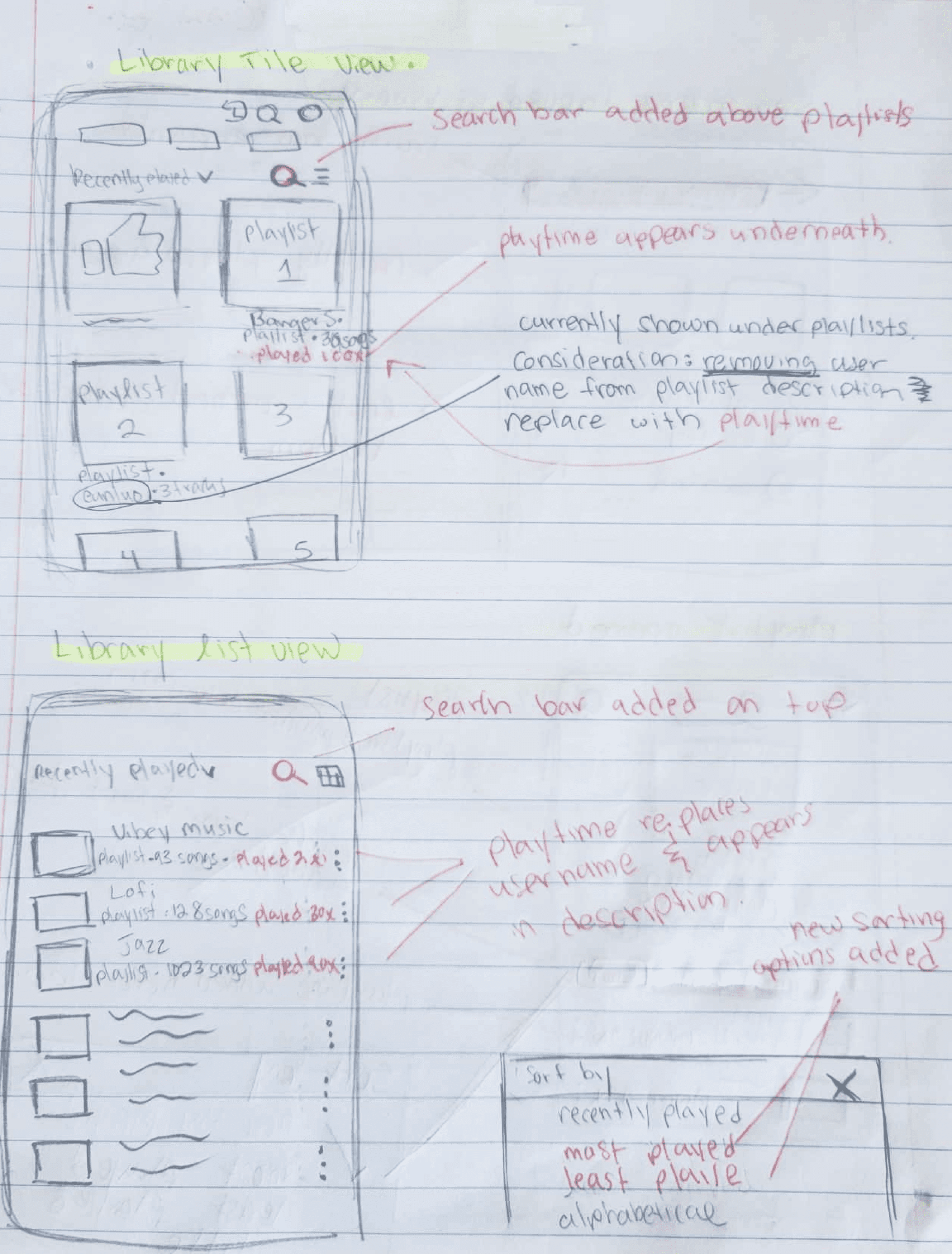

Each screen displays a hand-drawn replication of the key screens I planned to design on Figma. Items colored in red represent new icons or other UI additions for the features I planned to add.
Drawings were then translated into Figma as mid-fidelity designs. Basic connections were created in order to prepare for mid-fidelity user testing.
Participants said the features were well-designed, however…
4/5 users were confused by the playtime indicator; they did not understand what it was representing and felt like it made the containers look crowded - redesign needed
One participant pointed out that it felt "odd" when the search bar opened a new screen; "I expected to be able to type right away" - flow reconsideration needed
4/5 users chose to sort their items by "most played" - validates our feature addition
2/5 users said the note board looked "a little complicated", but this could be due to the fact frames were handrawn and presented to users - validation needed in final user test


Now that we received good feedback, let's finalize the features
Extra Sorting Options
Press image to enlarge
Two new sorting types added; users will have to choose the best option they would use the most. I am expecting them to select the ones I added.
Additionally, showcasing song or playlist play times will be added to accommodate the sorting features
Pinning/Removing Home Page Items
Press image to enlarge
Ability to pin and remove items from the home page added
Viewing Play times
Press image to enlarge
Viewing Playtimes
Press image to enlarge
Play time indicators were added to provide more information for users
Play time indicators were added to provide more information for users
I wanted to investigate whether the features added are ones that users would actively use. The features are designed for playlist creation, song searching, and customization. After testing, users were asked to share their thoughts.
I wanted to investigate whether the features added are ones that users would actively use. The features are designed for playlist creation, song searching, and customization. After testing, users were asked to share their thoughts.
Set up is complete
Let's design
Setting up the frames & testing
Setting up the frames & testing
Hand-drawn low-fidelity sketches were created first, and then translated onto Figma for user testing. I wanted to ensure that the designs and button placements were correctly designed, ensuring no misclicks or confusion.
Hand-drawn low-fidelity sketches were created first, and then translated onto Figma for user testing. I wanted to ensure that the designs and button placements were correctly designed, ensuring no misclicks or confusion.
Wireframing and Testing
Wireframing and Testing
Each screen displays a hand-drawn replication of the key screens I planned to design on Figma. Items colored in red represent new icons or other UI additions for the features I planned to add.
Each screen displays a hand-drawn replication of the key screens I planned to design on Figma. Items colored in red represent new icons or other UI additions for the features I planned to add.
Drawings were then translated into Figma as mid-fidelity designs. Basic connections were created in order to prepare for mid-fidelity user testing.
Drawings were then translated into Figma as mid-fidelity designs. Basic connections were created in order to prepare for mid-fidelity user testing.
Testers said the features were well-designed, however…
Participants said the features were well designed, however
4/5 users were confused by the playtime indicator; they did not understand what it was representing and felt like it made the containers look crowded - redesign needed
One participant pointed out that it felt "odd" when the search bar opened a new screen; "I expected to be able to type right away" - flow reconsideration needed
4/5 users chose to sort their items by "most played" - validates our feature addition
2/5 users said the note board looked "a little complicated", but this could be due to the fact frames were handrawn and presented to users - validation needed in final user test
More Projects

Skylines

Now that we received good feedback, let's finalize the features
Now that we received good feedback, let's finalize the features
More Projects
Skylines
Feature designs
Feature designs
Feature designs
Designs below were referenced from screenshots taken from the platform. New feature components were designed with the same fonts, colors, and styles to fit YTM's style. Iterations were made based on mid-fidelity user tests.
Designs below were referenced from screenshots taken from the platform. New feature components were designed with the same fonts, colors, and styles to fit YTM's style. Iterations were made based on mid-fidelity user tests.
Designs below were referenced from screenshots taken from the platform. New feature components were designed with the same fonts, colors, and styles to fit YTM's style. Iterations were made based on mid-fidelity user tests.


Are our features functional?
Are our features functional?
Are our features functional?
To evaluate the features' effectivenesses and usability, we recruited five participants who completed a series of tasks to explore the app’s features. They shared their experiences after each task and overall impressions of the design
To evaluate the features' effectivenesses and usability, we recruited five participants who completed a series of tasks to explore the app’s features. They shared their experiences after each task and overall impressions of the design
To evaluate the features' effectivenesses and usability, we recruited five participants who completed a series of tasks to explore the app’s features. They shared their experiences after each task and overall impressions of the design
Test Goals
Test Goals
Test Goals
1. Ensure added sorting options are categories users would use
2. Observe whether pinning or removing items feels fluid and is considered useful
3. Determine whether viewing playtimes is beneficial for users
4. Ensure search bars are used effectively and streamline the user experience across flow
1. Ensure added sorting options are categories users would use
2. Observe whether pinning or removing items feels fluid and is considered useful
3. Determine whether viewing playtimes is beneficial for users
4. Ensure search bars are used effectively and streamline the user experience across flow
1. Ensure added sorting options are categories users would use
2. Observe whether pinning or removing items feels fluid and is considered useful
3. Determine whether viewing playtimes is beneficial for users
4. Ensure search bars are used effectively and streamline the user experience across flow
I wanted to investigate whether the features added are ones that users would actively use. The features are designed for playlist creation, song searching, and customization. After testing, users were asked to share their thoughts.
Results and revisions
Results and revisions
Results and revisions
Overall, user tests were a success and the app was fully functional! All features were positively received by users with 100% success rate for task completion.
All users said the pinning feature was their favorite and would use that feature the most
All users selected "most played" as their sorting option
All users would use the search bar within a playlist to find specific items, but most of the time, would rely on sorting instead
Adding to the Pin Feature
Adding to the Pin Feature
Adding to the Pin Feature
Users liked pinning, but wanted more
Users liked pinning, but wanted more
Users liked pinning, but wanted more
Users mentioned wanting the ability to pin songs & playlists
Participants expect these pinned items to appear on the home page as well
Users mentioned wanting the ability to pin songs & playlists
Participants expect these pinned items to appear on the home page as well
Users mentioned wanting the ability to pin songs & playlists
Participants expect these pinned items to appear on the home page as well
Ability to pin song/playlist to home page flow created
Ability to pin song/playlist to home page flow created
Ability to pin song/playlist to home page flow created


Changing Play Times Visual
Changing Play Times Visual
Changing Play Times Visual
It looked a bit too cluttered
It looked a bit too cluttered
It looked a bit too cluttered
Users enjoyed viewing their playtimes and described it as a "cool feature to see"
However, found the rows of songs looking too visually packed with information.
Users enjoyed viewing their playtimes and described it as a "cool feature to see"
However, found the rows of songs looking too visually packed with information.
Users enjoyed viewing their play times and described it as a "cool feature to see"
However, found the rows of songs looking too visually packed with information.
Spacing was increased to provide more breathing room
Spacing was increased to provide more breathing room
Spacing was increased to provide more breathing room


Final takeaways
Final takeaways
This project was both fun and interesting to work on. As a daily YouTube Music user, I enjoyed iterating on an app I personally use. However, my biggest challenge was the lack of YTM participants, which led me to compromise and recruit Spotify users as well. As a result, my testing results may be somewhat skewed.
I relied heavily on my findings from user interviews, Reddit discussions and Google reviews to iterate and exectute. Nonetheless, I believe the features were well-designed and functional, effectively addressing user frustrations as a whole.
Final Takeaways
This project was by far the most challenging one I’ve worked on. Building a complete end-to-end application with multiple features, branding, and meticulously designed micro-interactions truly put my skills to the test.
I conducted extensive external research, analyzing existing applications on the market, and taught myself how to implement complex feature interactions. However, due to time constraints and Figma limitations, I had to unfortunately discard some feature ideas.
A very surprising lesson I learned was
A very suprising lesson I learned was
A very surprising lesson I learned was
People across different platforms, even within music streaming apps, have varying listening patterns. Spotify users tend to create playlists and use customization tools more frequently, whereas YouTube Music listeners rely on the algorithm to suggest the best songs/playlists, selecting music directly from the home page.
People across different platforms, even within music streaming apps, have varying listening patterns. Spotify users tend to create playlists and use customization tools more frequently, whereas YouTube Music listeners rely on the algorithm to suggest the best songs/playlists, selecting music directly from the home page.
People across different platforms, even within music streaming apps, have varying listening patterns. Spotify users tend to create playlists and use customization tools more frequently, whereas YouTube Music listeners rely on the algorithm to suggest the best songs/playlists, selecting music directly from the home page.
More Projects