
Rembi
Designing a mobile application
Rembi
Rembi
Simplifying your schedule, all in one app
Simplifying your schedule, all in one app
UX/UI DESIGN
MOBILE APP
MOBILE APP
MOBILE APP
SCHEDULING
SCHEDULING
SCHEDULING
PRODUCTIVITY
PRODUCTIVITY
PRODUCTIVITY

ROLE
ROLE
UX/UI Designer
UX/UI Designer
UX/UI Designer
Lead researcher and UI designer overseeing project from start to end
Lead researcher and UI designer overseeing project from start to end
TOOLS
TOOLS
Figma, Figjam, Discord, Procreate
Figma, Figjam, Discord, Procreate
Figma, Figjam, Discord, Procreate
Utilized various tools for branding, design, research, and interviews
Utilized various tools for branding, design, research, and interviews
DURATION
DURATION
100+ hours
100+ hours
100+ hours
Product created
Product created
Here's the sitch
Here's the sitch
Users often rely on multiple mobile applications to manage their daily schedules, leading to constant switching between apps to complete routine tasks. This fragmentation results in information overload, task mismanagement, and disorganization—making it difficult to manage. To address this, I created Rembi: a streamlined mobile app designed to simplify schedule maintenance all in one compact, intuitive space.
Users often rely on multiple mobile applications to manage their daily schedules, leading to constant switching between apps to complete routine tasks. This fragmentation results in information overload, task mismanagement, and disorganization—making it difficult to manage. To address this, I created Rembi: a streamlined mobile app designed to simplify schedule maintenance all in one compact, intuitive space.
Users often rely on multiple mobile applications to manage their daily schedules, leading to constant switching between apps to complete routine tasks. This fragmentation results in information overload, task mismanagement, and disorganization—making it difficult to manage. To address this, I created Rembi: a streamlined mobile app designed to simplify schedule maintenance all in one compact, intuitive space.
Now, what exactly is on the market and what are their functions?
Now, what exactly is on the market and what are their functions?
Now, what exactly is on the market and what are their functions?
Comparing Popular Apps
Comparing Popular Apps
Comparing Popular Apps
I conducted a comprehensive anaylsis on Notion, Samsung Notes, Google Tasks, and To-Do List to understand their services and top features. Apps were selected based on app store ranking and whether they focused on schedule managment, task managment, and organizaiton.
Multiple questions were created to kick things off:
What are the main usage patterns for each app?
What key features or services do they offer users?
What are the biggest frustrations with each app?
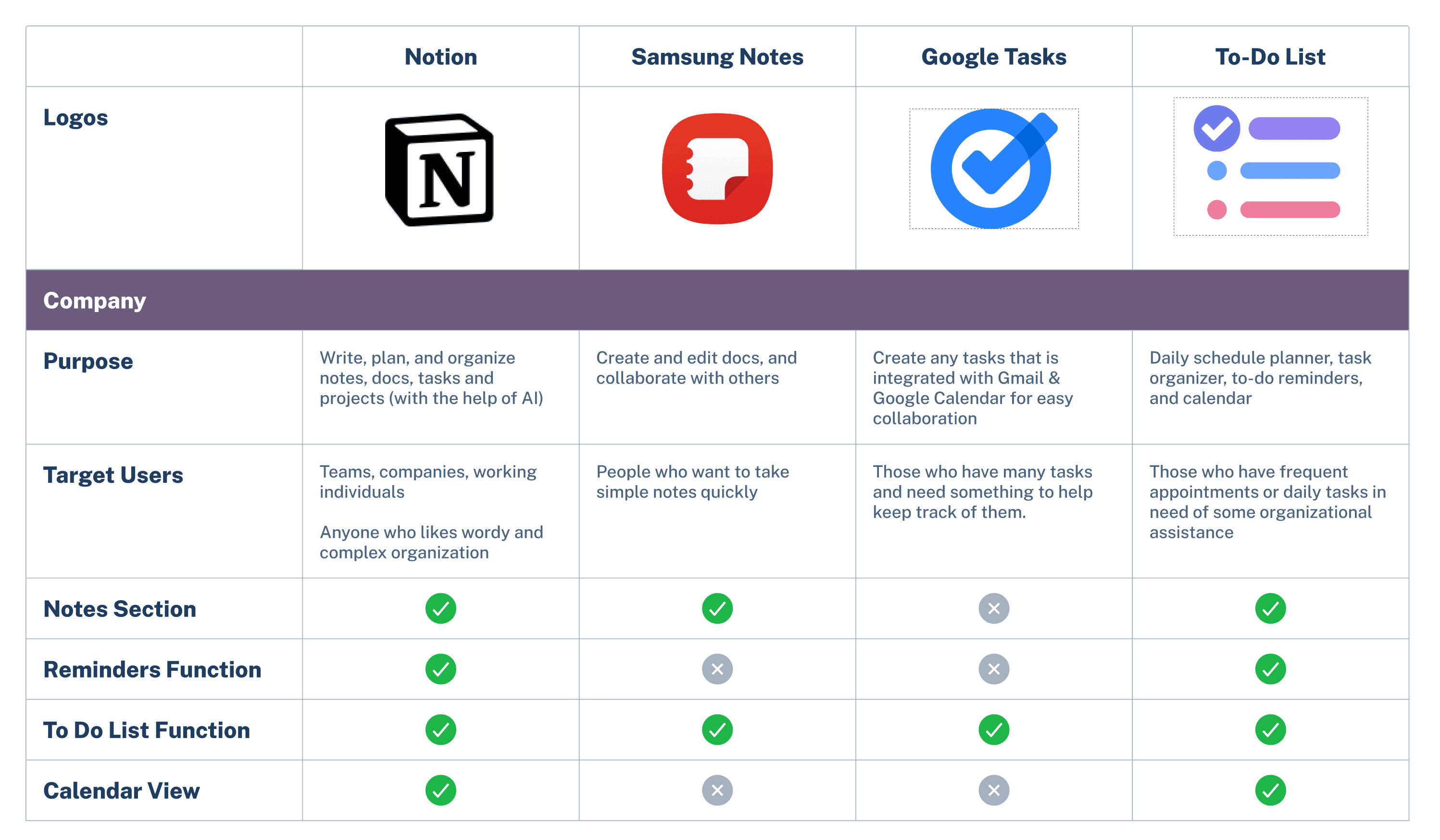
Overall
Each app excels in its own way and serves its intended purpose. However, when it comes to comprehensive schedule and task management, no single app offers all the necessary features to seamlessly handle all of the daily tasks at once. For example, Samsung Notes is great for basic note-taking for passing thoughts, but there is no Calendar or Alarm function.
Overall
Overall
Each app excels in its own way and serves its intended purpose. However, when it comes to comprehensive schedule and task management, no single app offers all the necessary features to seamlessly handle all of the daily tasks at once. For example, Samsung Notes is great for basic note-taking for passing thoughts, but there is no Calendar or Alarm function.
Each app excels in its own way and serves its intended purpose. However, when it comes to comprehensive schedule and task management, no single app offers all the necessary features to seamlessly handle all of the daily tasks at once. For example, Samsung Notes is great for basic note-taking for passing thoughts, but there is no Calendar or Alarm function.
Is this true?
Is this true?
Is this true?
Let's see what our interviewees think
Let's see what our interviewees think
Let's see what our interviewees think
Diving Deeper Into Our User Base
Diving Deeper Into Our User Base
Diving Deeper Into Our User Base
Market research revealed a clear gap: no single app covers all of the essential features a user needs on a daily basis. I needed to look into this hypothesis a bit deeper by conducting user interviews.
Market research revealed a clear gap: no single app covers all of the essential features a user needs on a daily basis. I needed to look into this hypothesis a bit deeper by conducting user interviews.
Market research revealed a clear gap: no single app covers all of the essential features a user needs on a daily basis. I needed to look into this hypothesis a bit deeper by conducting user interviews.
Our Participants
Our Participants
Our Participants
Interviewees were recruited from an Instagram poll I uploaded onto my profile. Since the goal was to create a compact mobile app, I needed participants who actively maintain their schedules on their phones.
After briefly speaking to each of them, everyone confirmed that they utilized 2 or more apps on their phones.

We aimed to gain deeper insights into the typical user flow, how users utilize their tools for schedule mangement, identifying the most commonly used app features, and uncovering the biggest pain points when using multiple tools.
We aimed to gain deeper insights into the typical user flow, how users utilize their tools for schedule mangement, identifying the most commonly used app features, and uncovering the biggest pain points when using multiple tools.
We aimed to gain deeper insights into the typical user flow, how users utilize their tools for schedule mangement, identifying the most commonly used app features, and uncovering the biggest pain points when using multiple tools.
Most important takeaways
Most important takeaways
Most important takeaways
People use notes app for quick to-do items or passing thoughts
People use notes app for quick to-do items or passing thoughts
People use notes app for quick to-do items or passing thoughts
Users enact in three steps or more for schedule maintenance, switching between platforms to complete their goals
Users enact in three steps or more for schedule maintenance, switching between platforms to complete their goals
Users enact in three steps or more for schedule maintenance, switching between platforms to complete their goals
Users typically do not look back on their notes, but often look back at their Calendar events or alarms
Users typically do not look back on their notes, but often look back at their Calendar events or alarms
Users typically do not look back on their notes, but often look back at their Calendar events or alarms
We've identified app usage intentions and painpoints
let's design
We've identified app usage intentions and painpoints
let's design
We've identified app usage intentions and painpoints
let's design
Creating the Initial Frames
Low-fidelity wireframe sketches were created with the basic noteboard layout and simple feature flows. Users would be taken to a bulletin-board-like page where all of the actionable features would reside. A tool bar with all of the features are included at the bottom.


Setting up Reminder

Reminders flow

Setting up Reminder
Reminders flow
Setting up Reminder
Reminders flow
Setting up Reminder
Reminders flow
Testing the Sketches
The scrollable menu was inspired by a layout I observed in another artist-focused program. I wanted a clear, accessible way to present all features directly in front of the user. To ensure the layout felt intuitive, I tested the frames with additional participants and gathered feedback on usability
GOALS:
1. Ensure design is intuitive and streamlined well
2. Observe whether icons are intuitive
3. Determine if design is too complicated
4. Determine if anything is missing or out of place
5. Observe if users tap on the correct buttons to complete tasks
Creating the Features
Creating the Features
Creating the Features
User interviews confirmed that users have to swtich back and forth between apps or other tools for regular schedule maintenance. Since Rembi aimed to streamline users into a single, consistent schedule maintenance flow, I identified the most frequently mentioned features from user interviews to incorporate onto the platform. There are four core features and three general features.
User interviews confirmed that users have to swtich back and forth between apps or other tools for regular schedule maintenance. Since Rembi aimed to streamline users into a single, consistent schedule maintenance flow, I identified the most frequently mentioned features from user interviews to incorporate onto the platform. There are four core features and three general features.
User interviews confirmed that users have to swtich back and forth between apps or other tools for regular schedule maintenance. Since Rembi aimed to streamline users into a single, consistent schedule maintenance flow, I identified the most frequently mentioned features from user interviews to incorporate onto the platform. There are four core features and three general features.
Core Features
Core Features
Core Features
Post-it notes - fun way to create notes
Checkboxes - to-do list
Calendar - to view upcoming events
Alarms - to actively remind user of their events
Post-it notes - fun way to create notes
Checkboxes - to-do list
Calendar - to view upcoming events
Alarms - to actively remind user of their events
Post-it notes - fun way to create notes
Checkboxes - to-do list
Calendar - to view upcoming events
Alarms - to actively remind user of their events
General Features
General Features
General Features
Search Bar - to search for items easily
Sorting Options - to help with organization
Pin - to highlight and prioritize certain items
Search Bar - to search for items easily
Sorting Options - to help with organization
Pin - to highlight and prioritize certain items
Search Bar - to search for items easily
Sorting Options - to help with organization
Pin - to highlight and prioritize certain items
Creating the Initial Frames
Creating the Initial Frames
Low-fidelity wireframe sketches were created with the basic noteboard layout and simple feature flows. Users would be taken to a bulletin-board-like page where all of the actionable features would reside. A tool bar with all of the features are included at the bottom.
Low-fidelity wireframe sketches were created with the basic noteboard layout and simple feature flows. Users would be taken to a bulletin-board-like page where all of the actionable features would reside. A tool bar with all of the features are included at the bottom.
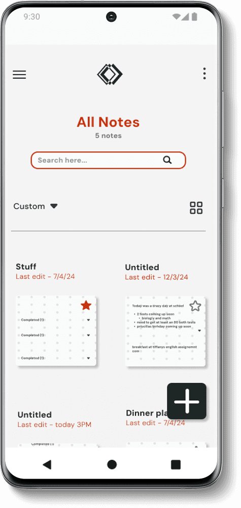
Note Board
Main note board; includes a lower task bar menu
To-Do List Feature
Check box feature visual
Setting up Reminder
Reminders flow
Sorting Option & Edit Mode
Custom Sorting option added for more freedom
Note Board
Main note board; includes a lower task bar menu
To-Do List Feature
Check box feature visual
Setting up Reminder
Reminders flow
Sorting Option & Edit Mode
Custom Sorting option added for more freedom
Note Board
Main note board; includes a lower task bar menu
To-Do List Feature
Check box feature visual
Setting up Reminder
Reminders flow
Sorting Option & Edit Mode
Custom Sorting option added for more freedom
Note Board
Main note board; includes a lower task bar menu
To-Do List Feature
Check box feature visual
Setting up Reminder
Reminders flow
Sorting Option & Edit Mode
Custom Sorting option added for more freedom
Testing the Sketches
Testing the Sketches
The scrollable menu was inspired by a layout I observed in another artist-focused program. I wanted a clear, accessible way to present all features directly in front of the user. To ensure the layout felt intuitive, I tested the frames with additional participants and gathered feedback on usability
GOALS:
1. Ensure design is intuitive and streamlined well
2. Observe whether icons are intuitive
3. Determine if design is too complicated
4. Determine if anything is missing or out of place
5. Observe if users tap on the correct buttons to complete tasks
1. Ensure design is intuitive and streamlined well
2. Observe whether icons are intuitive
3. Determine if design is too complicated
4. Determine if anything is missing or out of place
5. Observe if users tap on the correct buttons to complete tasks
Participants said the app has everything they need, successfully navigated through the screens, and selected the correct icons according to session prompts
Iterations needed
Post it icon was the only icon that confused users - redesign needed
A few items from the reminders modal was missing such as the ability to set the alarm within a date range - Addition Needed
2/5 users said the note board looked "a little complicated", but this could be due to the fact frames were handrawn and presented to users - validation needed in final user test
Participants said the app has everything they need, successfully navigated through the screens, and selected the correct icons according to session prompts
Participants said the app has everything they need, successfully navigated through the screens, and selected the correct icons according to session prompts
Iterations needed
Post it icon was the only icon that confused users - redesign needed
A few items from the reminders modal was missing such as the ability to set the alarm within a date range - Addition Needed
2/5 users said the note board looked "a little complicated", but this could be due to the fact frames were handrawn and presented to users - validation needed in final user test
It's time to finalize the look and feel
It's time to finalize the look and feel
It's time to finalize the look and feel
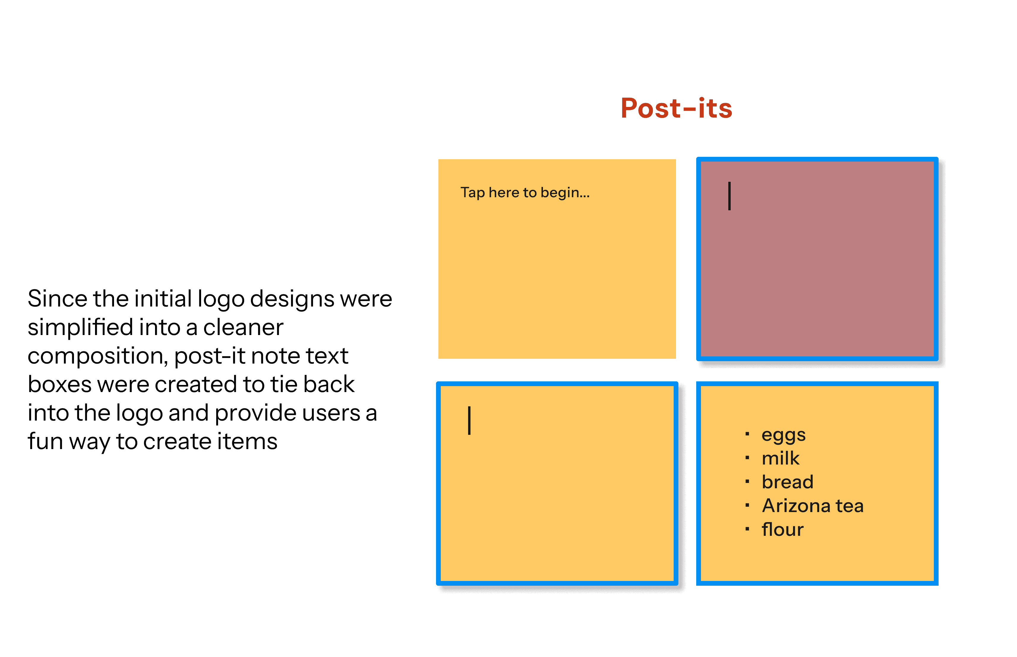
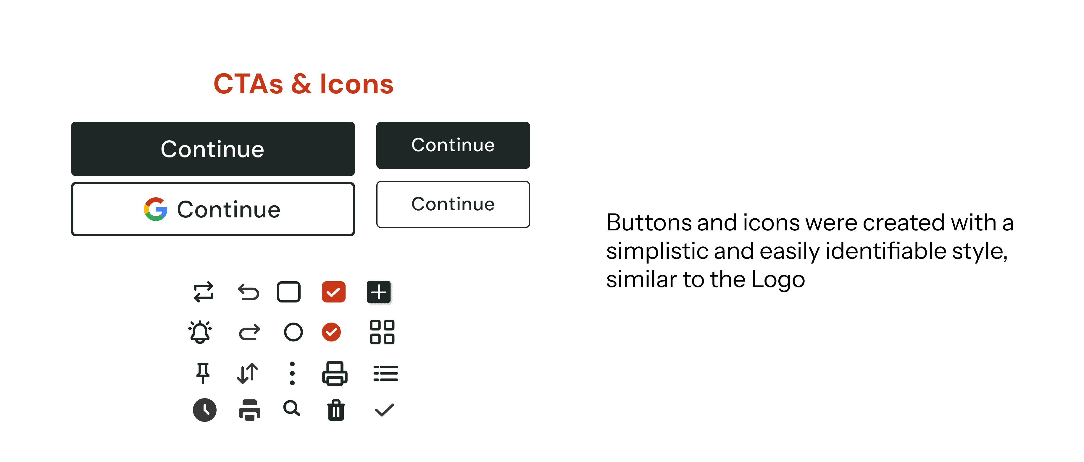
The post it note feature is the key part of the product that makes it unique. We wanted that uniqueness to the be the face of our brand.
Though we liked the inital designs shown here, we felt like it did not match the products values and vibe. We wanted something a bit cleaner and minimalistic
Logo First Drafts
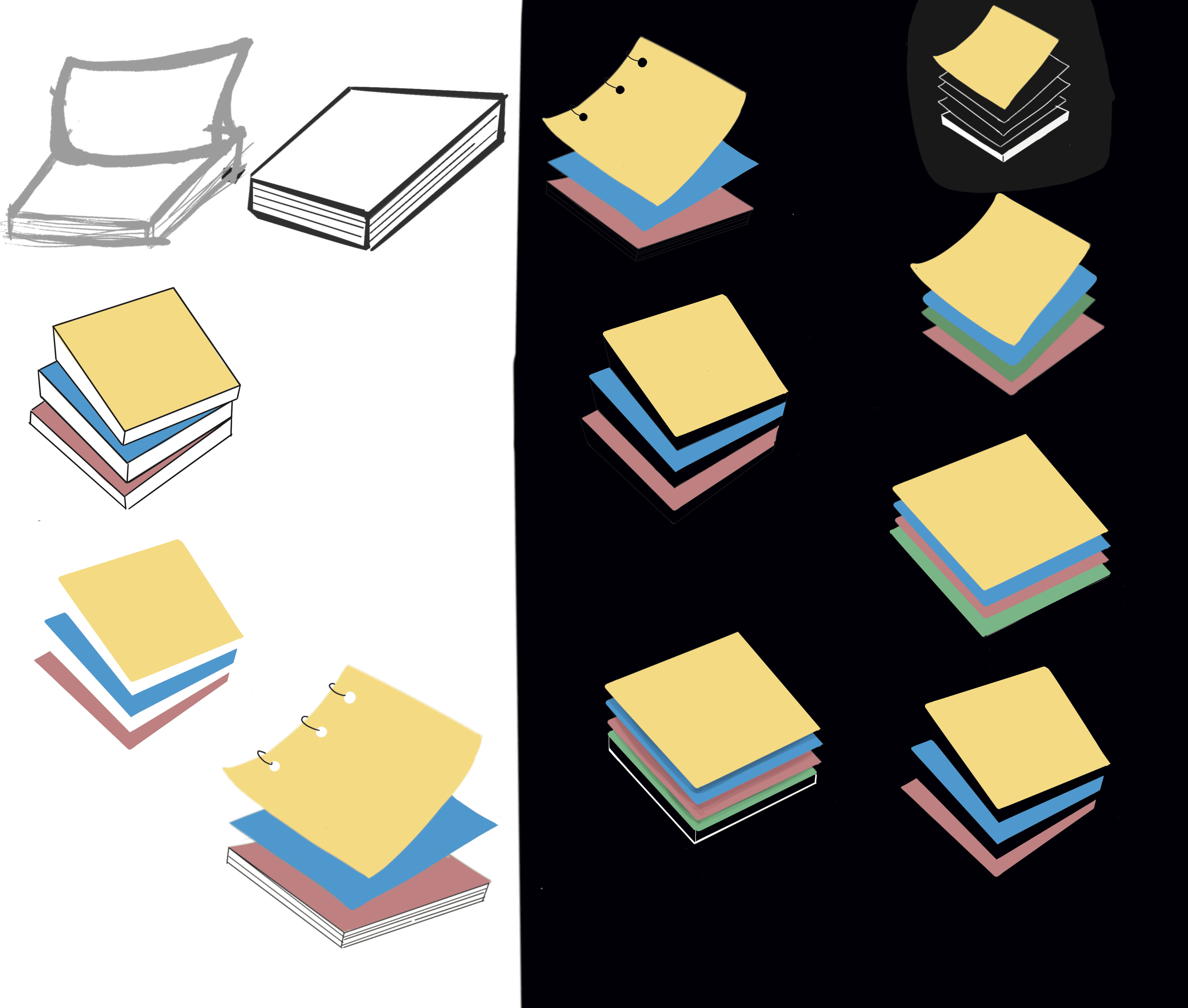
Thus, the final logo was born
A black and white logo that is composed of three squares that were placed together to created a dynamic, and unqiue layered visual.
Definining the Values
Definining the Values
Definining the Values
Rembi is a new app on the market that needs some personality!
I defined three core values to help shape Rembi’s brand identity. By reflecting on the app’s core purpose and user needs, I distilled these values:
Rembi is a new app on the market that needs some personality!
I defined three core values to help shape Rembi’s brand identity. By reflecting on the app’s core purpose and user needs, I distilled these values:
Rembi is a new app on the market that needs some personality!
I defined three core values to help shape Rembi’s brand identity. By reflecting on the app’s core purpose and user needs, I distilled these values:
Efficieny is the Priority
this is what we’re all about—no need to switch between different apps
Efficieny is the Priority
this is what we’re all about—no need to switch between different apps
Efficieny is the Priority
this is what we’re all about—no need to switch between different apps
Be the tool to tinker with
Be the tool to tinker with
Be the tool to tinker with
Experiment and innovate—so your ideas can flow freely
Experiment and innovate—so your ideas can flow freely
Experiment and innovate—so your ideas can flow freely
Prioritize, not monetize
Prioritize, not monetize
Prioritize, not monetize
No sign-ups, no fees—just take some notes
No sign-ups, no fees—just take some notes
No sign-ups, no fees—just take some notes
The post it note feature is the key part of the product that makes it unique. We wanted that uniqueness to the be the face of our brand.
The post it note feature is the key part of the product that makes it unique. We wanted that uniqueness to the be the face of our brand.
Though we liked the inital designs shown here, we felt like it did not match the products values and vibe. We wanted something a bit cleaner and minimalistic
Though we liked the inital designs shown here, we felt like it did not match the products values and vibe. We wanted something a bit cleaner and minimalistic
Logo First Drafts
Logo First Drafts
Thus, the final logo was born
Thus, the final logo was born
A black and white logo that is composed of three squares that were placed together to created a dynamic, and unqiue layered visual.
A black and white logo that is composed of three squares that were placed together to created a dynamic, and unqiue layered visual.
Finalizing the style
Finalizing the style
Finalizing the style
Below is a collection of font styles, colors, and resusable components
Below is a collection of font styles, colors, and resusable components
Below is a collection of font styles, colors, and resusable components


Set up is done
Set up is done
Set up is done
Let's see the final product
Let's see the final product
Let's see the final product
Welcome Rembi!
Welcome Rembi!
Welcome Rembi!


Consistency, clarity, and readability were our top priorities. We designed engaging visuals to offer users a fresh and enjoyable way to take notes and create memos
Consistency, clarity, and readability were our top priorities. We designed engaging visuals to offer users a fresh and enjoyable way to take notes and create memos
Consistency, clarity, and readability were our top priorities. We designed engaging visuals to offer users a fresh and enjoyable way to take notes and create memos
Features
Features
Features
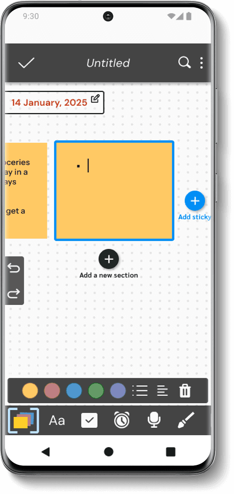
Post-it Notes
Post-it Notes
Post-it Notes
Visually created to resemble real post it notes with a variety of customizable settings on the lower bar
Bullet points available for list making
Sections available to help organize different topics
Visually created to resemble real post it notes with a variety of customizable settings on the lower bar
Bullet points available for list making
Sections available to help organize different topics
Visually created to resemble real post it notes with a variety of customizable settings on the lower bar
Bullet points available for list making
Sections available to help organize different topics


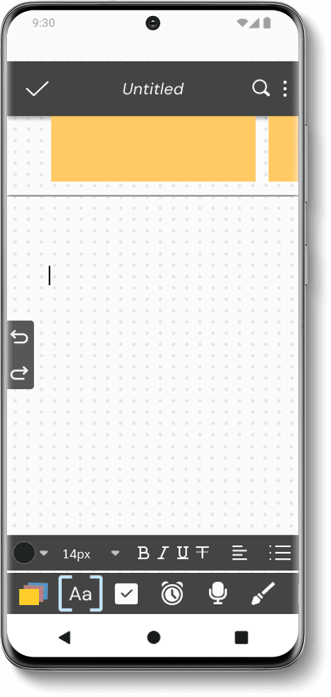
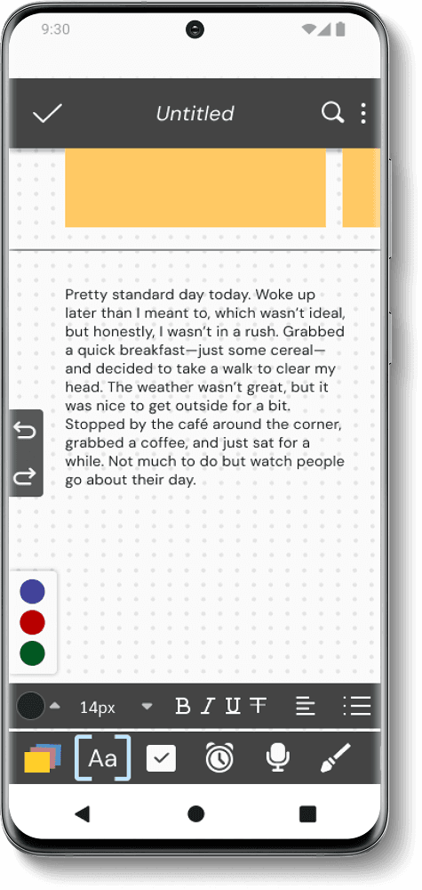
Text Boxes
Text Boxes
Text Boxes
Standard text option available for users
Colors were selected based on WCAG AAA standards
Bullet point feature available (mentioned during user interviews)
Standard text option available for users
Colors were selected based on WCAG AAA standards
Bullet point feature available (mentioned during user interviews)
Standard text option available for users
Colors were selected based on WCAG AAA standards
Bullet point feature available (mentioned during user interviews)

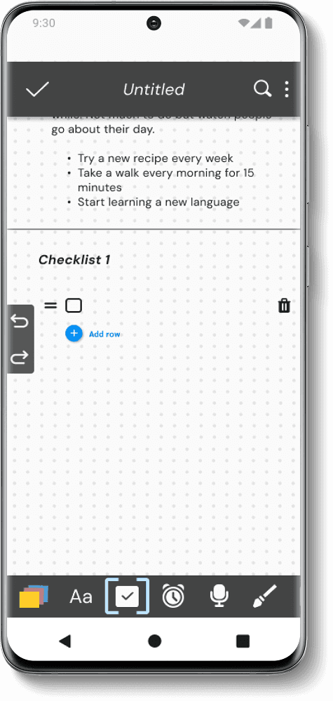
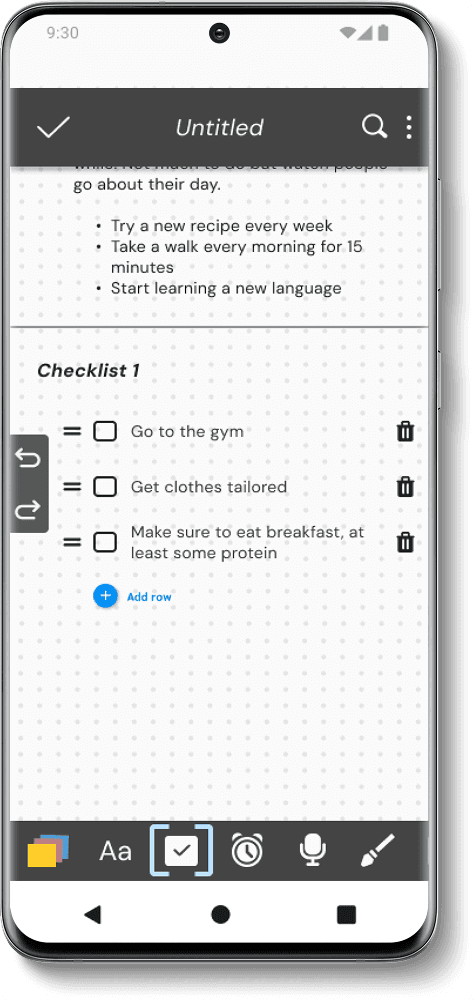
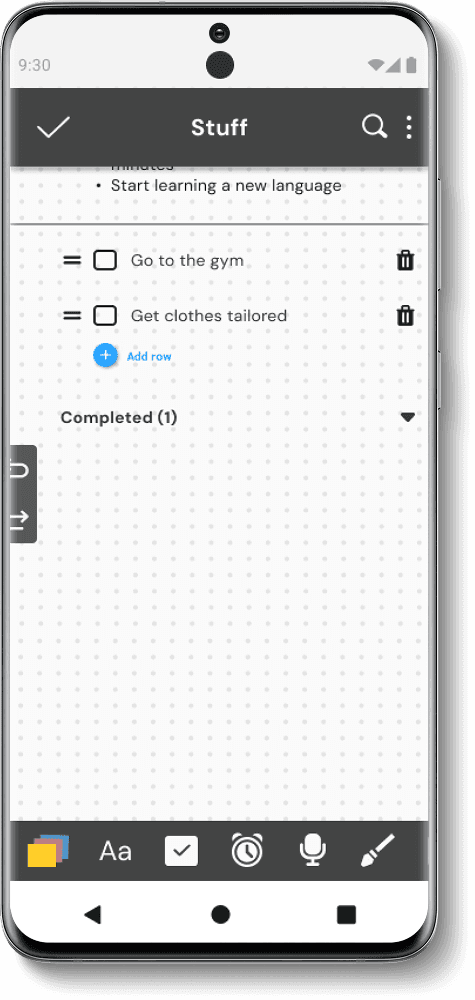
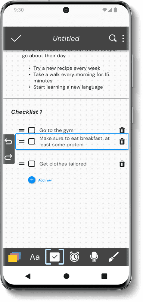
Checklists
Checklists
Checklists
Make endless lists to fit user needs
Ability to freely rearrange each item in order of importance
Item's never delete and will always be there for records
Make endless lists to fit user needs
Ability to freely rearrange each item in order of importance
Item's never delete and will always be there for records
Make endless lists to fit user needs
Ability to freely rearrange each item in order of importance
Item's never delete and will always be there for records

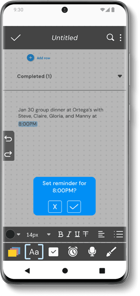
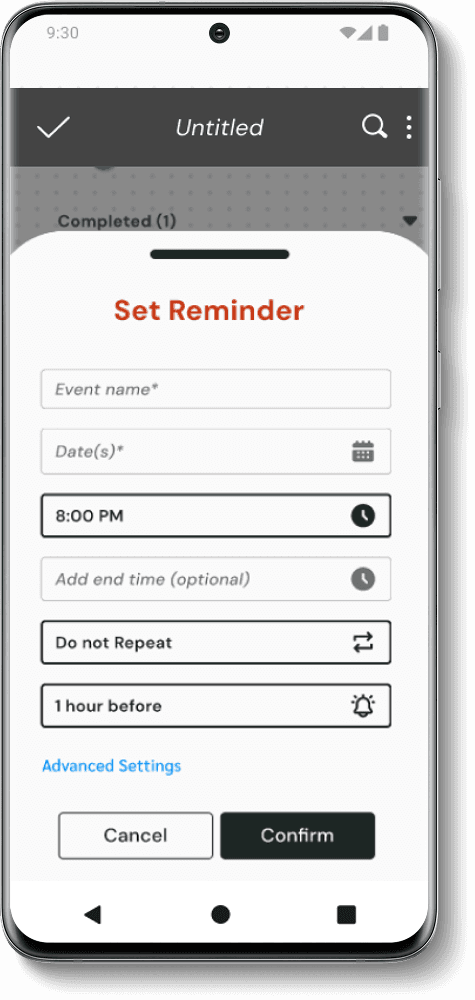
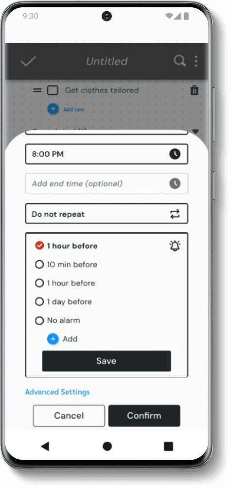
Auto Reminder
Recognition
Auto Reminder Recognition
Auto Reminder
Recognition
Ability to set reminders on the spot
The app recognizes when a time as been entered and allows users to set up reminders in the moment
A visual indication around the note or item available
Ability to set reminders on the spot
The app recognizes when a time as been entered and allows users to set up reminders in the moment
A visual indication around the note or item available
Ability to set reminders on the spot
The app recognizes when a time as been entered and allows users to set up reminders in the moment
A visual indication around the note or item available

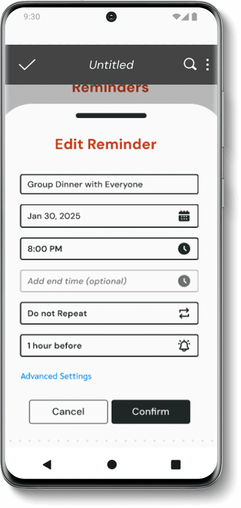
Reminders Page
Reminders Page
Reminders Page
All reminders set are available on the Reminders page
Upcoming alarms are shown at the bottom for easy editing and deletion
Past reminders stay on record for reference later
All reminders set are available on the Reminders page
Upcoming alarms are shown at the bottom for easy editing and deletion
Past reminders stay on record for reference later
All reminders set are available on the Reminders page
Upcoming alarms are shown at the bottom for easy editing and deletion
Past reminders stay on record for reference later


Edit Mode
Edit Mode
Edit Mode
Simple editing mode to help with organization
Custom sorting option available if users want to freely move items around
Items can be titled and show las edit date
Simple editing mode to help with organization
Custom sorting option available if users want to freely move items around
Items can be titled and show las edit date
Simple editing mode to help with organization
Custom sorting option available if users want to freely move items around
Items can be titled and show las edit date


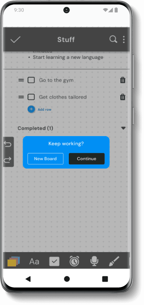
Keep Working?
Keep Working?
Keep Working?
If a user re-opens the app after a long period of inactivity, a reminder pop out appears, allowing users to decide whether they want to create a new Note Board or continue working on the same one
If a user re-opens the app after a long period of inactivity, a reminder pop out appears, allowing users to decide whether they want to create a new Note Board or continue working on the same one

Is Our App Functional?
Is Our App Functional?
To evaluate the product's effectiveness and usability, we recruited five participants who completed a series of tasks to explore the app’s features. They shared their experiences after each task and overall impressions of the design
To evaluate the product's effectiveness and usability, we recruited five participants who completed a series of tasks to explore the app’s features. They shared their experiences after each task and overall impressions of the design
Test Goals
1. Ensure task bar menu and CTA items are intuitive, specifically the post it, text box, and check box icons
2. Observe if automatic alarm setting process is streamlines properly without confusion
3. Determine if adding/deleting post its notes is an easy and intuitive process
4. Ensure users are able to find their reminder lists
5. Ensure home page editing system is intuitive and properly used
6. Determine if pop up reminder is postitively received by users
Is Our App Functional?
To evaluate the product's effectiveness and usability, we recruited five participants who completed a series of tasks to explore the app’s features. They shared their experiences after each task and overall impressions of the design
Test Goals
1. Ensure task bar menu and CTA items are intuitive, specifically the post it, text box, and check box icons
2. Observe if automatic alarm setting process is streamlines properly without confusion
3. Determine if adding/deleting post its notes is an easy and intuitive process
4. Ensure users are able to find their reminder lists
5. Ensure home page editing system is intuitive and properly used
6. Determine if pop up reminder is postitively received by users
Results and Revisions
Overall, user tests were a success and the app was fully functional! The app features were positively received by all users.
All users completed every task with very minor to no issues
The automatic reminder setting feature was the most popular amongst all users
Users stated they would utilize the checkboxes and reminders features the most
Confusion with "+" CTAS
Users glossed over the button on the right hand side when asked to add a new sticky
4/5 users tried to click the "add a new section" button when asked to add a new sticky note
Before
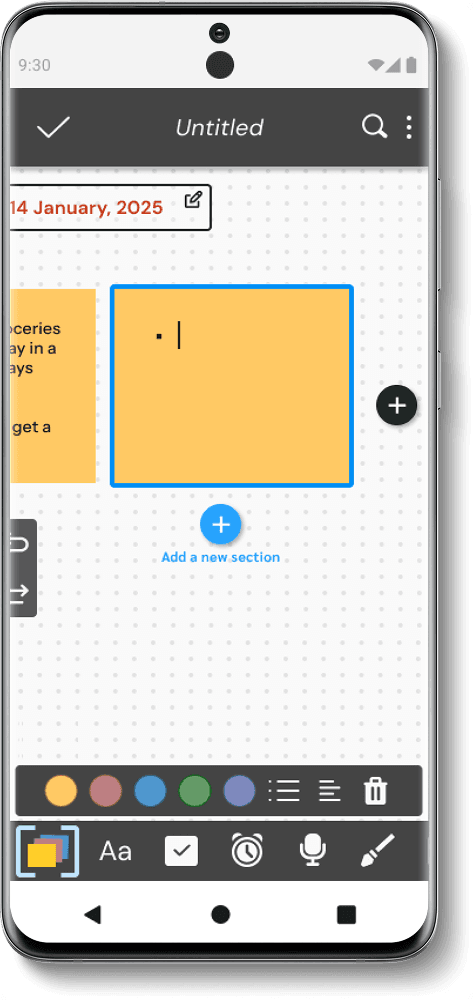
After
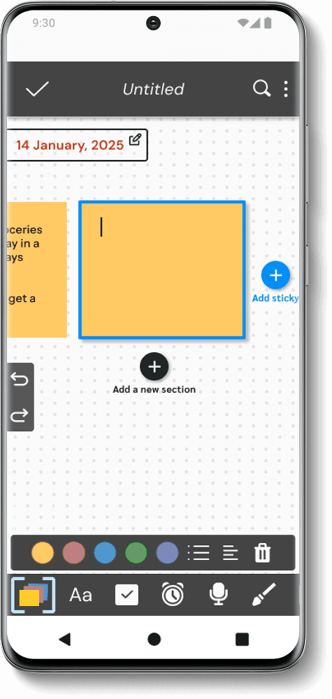
Colors were swapped to highlight the "add sticky" button and text was added for more instruction
Unclear action indicators
2/5 users did not realize that the upcoming alarms were editable
Page was initally titled as "Alarms", but was changed to "Reminders" according to user feedback
Before
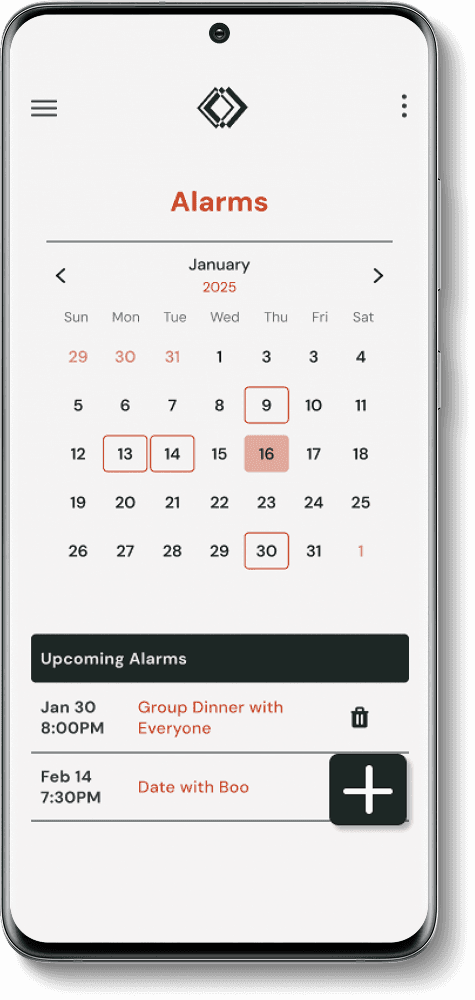
After
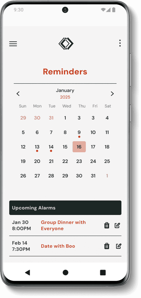
Edit icon was added to indicate that upcoming alarms are editable and page title was changed to "Reminders"
Missing modal options
3/5 users said they typically repeat their reminders to ring multiple times beforehand
Before

After
Additional settings were added that allows users to add more than one reminder for a single event
Visual indicators needed
Feature was described as "straightforward" and easy"
One minor update was to have visual cue that items were moving
Before
After
Blue outline around moving items were added
Results and Revisions
Results and Revisions
Overall, user tests were a success and the app was fully functional! The app features were positively received by all users.
Overall, user tests were a success and the app was fully functional! The app features were positively received by all users.
All users completed every task with very minor to no issues
The automatic reminder setting feature was the most popular amongst all users
Users stated they would utilize the checkboxes and reminders features the most
All users completed every task with very minor to no issues
The automatic reminder setting feature was the most popular amongst all users
Users stated they would utilize the checkboxes and reminders features the most
Before
Confusion with "+" CTAS
Users glossed over the button on the right hand side when asked to add a new sticky
4/5 users tried to click the "add a new section" button when asked to add a new sticky note
After
Colors were swapped to highlight the "add sticky" button and text was added for more instruction
Before
Unclear action indicators
2/5 users did not realize that the upcoming alarms were editable
Page was initally titled as "Alarms", but was changed to "Reminders" according to user feedback
After
Edit icon was added to indicate that upcoming alarms are editable and page title was changed to "Reminders"
Before
Missing Modal Options
3/5 users said they typically repeat their reminders to ring multiple times beforehand
After
Additional settings were added that allows users to add more than 1 reminder for a single event
Before
Unclear action indicators
2/5 users did not realize that the upcoming alarms were editable
Page was initally titled as "Alarms", but was changed to "Reminders" according to user feedback
After
Edit icon was added to indicate that upcoming alarms are editable and page title was changed to "Reminders"
Before
Missing modal options
3/5 users said they typically repeat their reminders to ring multiple times beforehand
After
Additional settings were added that allows users to add more than one reminder for a single event
Before
Confusion with "+" CTAS
Users glossed over the button on the right hand side when asked to add a new sticky
4/5 users tried to click the "add a new section" button when asked to add a new sticky note
After
Colors were swapped to highlight the "add sticky" button and text was added for more instruction
More Projects

Skylines

Before
Visual indicators needed
Visual indicators needed
Feature was described as "straightforward" and easy"
One minor update was to have visual cue that items were moving
Feature was described as "straightforward" and easy"
One minor update was to have visual cue that items were moving
After
Blue outline around moving items were added
Blue outline around moving items were added
Final Takeaways
Final Takeaways
This project was by far the most challenging one I’ve worked on. Building a complete end-to-end application with multiple features, branding, and meticulously designed micro-interactions truly put my skills to the test.
I conducted extensive external research, analyzing existing applications on the market, and taught myself how to implement complex feature interactions. However, due to time constraints and Figma limitations, I had to unfortunately discard some feature ideas.
Final Takeaways