


CaliRent
an end-to-end case study

Overview
Rent easily, reliably, and comfortably. CaliRent is the newest renting website that aims to help young adults experience a faster moving process by providing live application updates, upfront safety ratings, and credible resources.
Role
UX/UI Designer
User research, user interviews, wireframing, visual design, prototyping & testing
Tool Kit
Figma, Procreate, Figjam, Qualtrics, Calendly, Zoom, OBS Studio
Duration
March 2024 - June 2024
15 weeks
10 user tests
150+ hours
Simple layout
Fun graphics
Easy navigation
I want to share a bit of background first
If things are more expensive in California, why are the younger generations moving?


School and job opportunties!
The big question
If young adults need to move due to personal and career reasons, how can we reduce stress and the financial burden that can come from moving to a new place?
An individual's early 20's if packed full of responsibilties, career choices, and relationships. So, stressful moves should be the last of their worries and I want to figure out a way to help.
Starting off with an assumption
I needed to set a baseline for myself to guide my research and ideas. To kick things off, I formulated two hypothesis around stress:
I hypothesized that financial stress would be the biggest contributor to a difficult moving process
I hypothesized that organizational stress would be the biggest contributor to a difficult moving process, specifically furniture arrangement
Since inflation is at an all time high right now in California, financial burden could be a high stress-causing factor for new graduates and students. This could stem from having to buy furniture or other household items.
The lack of organizational tools could be another possible stress inducer. I wanted to focus on home layout and arrangement, but organizational stress could also include planning out a move as well.
Comparing what's on the market
Now that I had some guidance, I opened up Google and began my search for the types of services that could help people who are moving to new areas.
Offer Up

Financial burden could stem from purchasing new household items/furniture.
I wanted to see what sites were available that sold items at a lower price point, specficially items that were available for purchase locally.
What it is: a place to buy and sell items locally for cheaper pricces
Pros
easy to navigate website
wide selection of categories
easy purchasing system
Cons
poor customer service
scams for buyers and sellers
limited website functionality
Move Advisor

I wondered if there were moving organizational tools, and to my surprise, there are only a small handful. I chose Move Advisor since it was directly related to moving.
What it is: app that connects users with outer moving companies and offers tools to help plan a move.
Pros
virtual room mapping
editable checklists for organization
Cons
limited room mapping capabilities
requires paid membership for other tools
company releases user information
YouTube

To tie it all together, I wanted to see what moving-related videos were available.
What it is: online platform where people can upload their own entertainment or informational content
Pros
visual instruction and stimulation
easily usable site
credible content
Cons
lack of informational moving videos
I found that
There is an overall lack of resources available for people who plan to move.
Connecting with users
Survey Results: An Unexpected Turn!
I hypothesized that financial stress would be the biggest contributor toi a difficult moving process
Hypothesis 1 was already debunked and I hadn't even started interviews yet!
or so I thought…
What I found
4/5 users did not use any moving services or other organization tools; one user said she tried Move Advisor, but uninstalled it due to spam calls
2/5 users felt disorganized when planning out their moving timeline, not when unpacking their items and furniture
4/5 users already had all of their furniture and/or bought new items from Facebook Marketplace or Ikea, and would not use other sites to buy items
Most importantly,
Most painpoints users experienced occured during the planning stages of the move: searching for and deciding on a home
After compling all the data, I found 4 themes

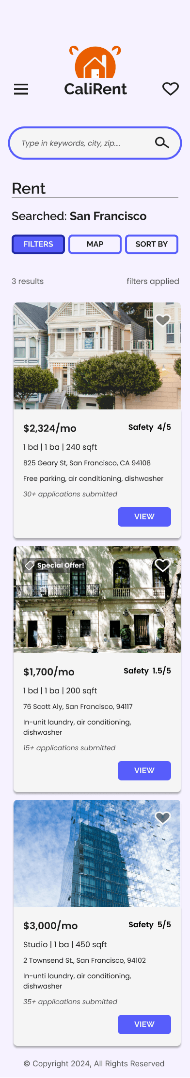
Safety was the number 1 priority when searching for a home
No clear way of knowing the status of your application
Leasing websites or other resources lack credibility and cause user frustration
Users are often on a time crunch and have to find a new home quickly
Essentially…
Both my hypothesis were proven wrong and I had to change the direction of my project. Luckily, my user interviews gave me lots of good data to build off from such as knowing that safety is a huge priority as well as no concrete application updates.
I shifted my focus onto the planning stages of the moving process and created solutions based on the themes found in affinity maps.

How might we's
Based on the affinity map insights, I created multiple "How Might We's" questions to move into the feature set with. I had some solutions already in mind, but framing them as questions gave me proper structure as I moved forward.
How might we provide timely updates about the status of a leasing app?
How might we provide crime statistics to help users find the safest area?
How might we build credibility amongst users and leasing websites?
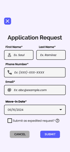
How might we create a faster application process?
I ultimately decided the best way to tackle these newly found user painpoints was to create my own leasing website.
Important features & pages
I conducted additional secondary research comparing and contrasting the two biggest leasing websites (Zillow & Apartments.com) to help create my feature set.
I took note of the most important pieces of information on each of the pages to become more familiar with what users would want to see while searching for a new home and tried to think about the optimal areas to include my solutions.
The biggest thing I noticed was how informationally packed both websites were since they catered their site for renters, buyers, and agents. I combatted this by making limiting my target audience to renters only.
airtable
Creating the flows
I created very detailed user flows that ultimately became a part of the task flows I tested in usability testing. I spent quite a bit of time on these to make sure the path that I laid out for users was the most optimal and convenient for them, covering all entry and exit points as much as possible.
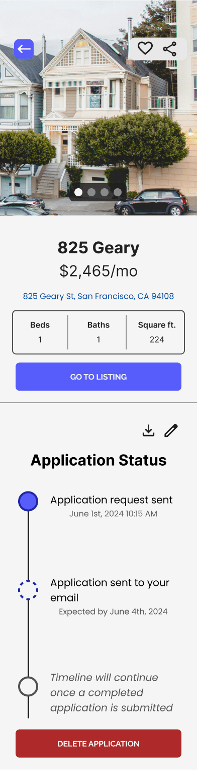
Viewing application status
Booking a tour
Viewing crime rate statistics
View property reviews
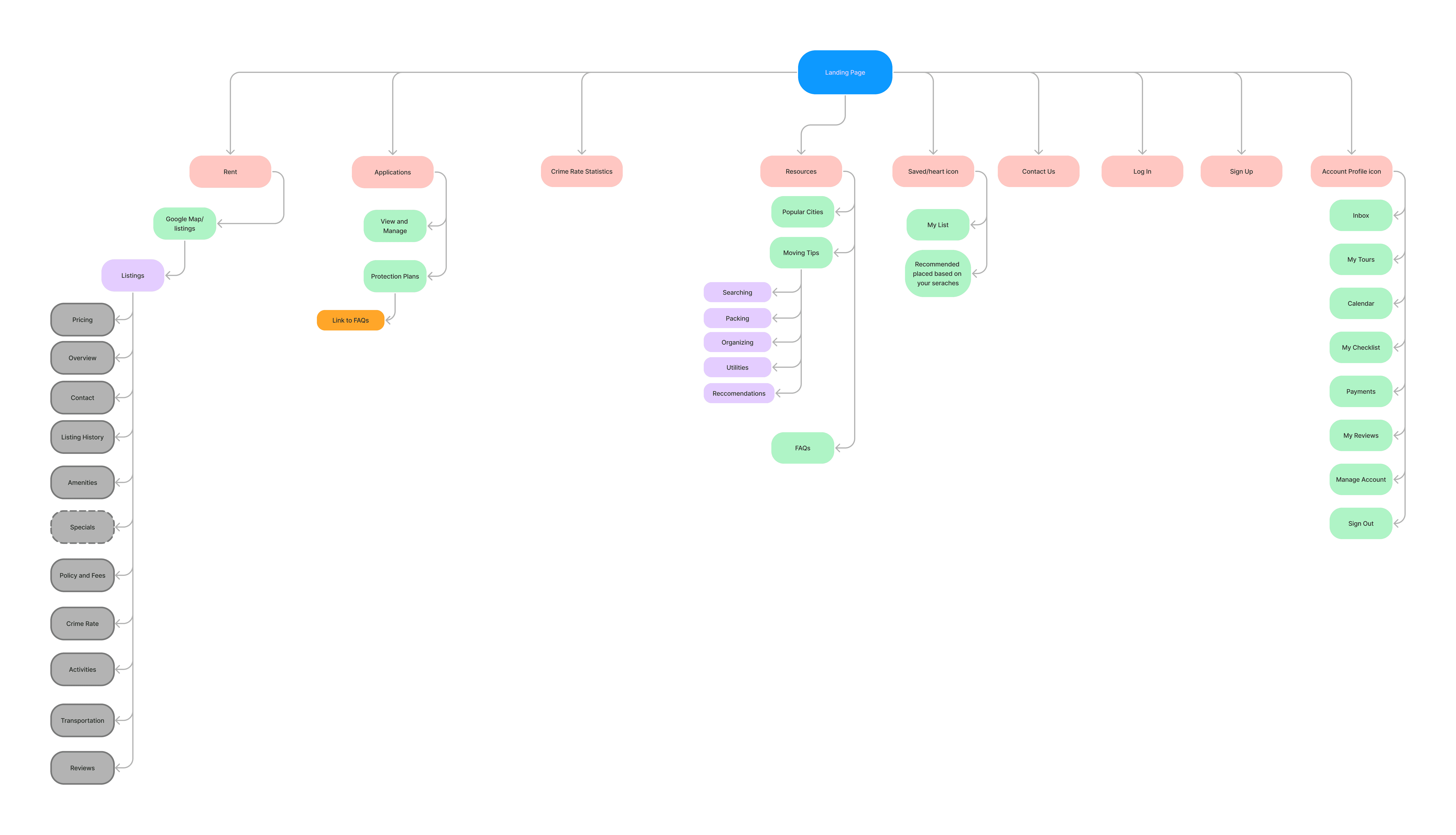
The basic layout
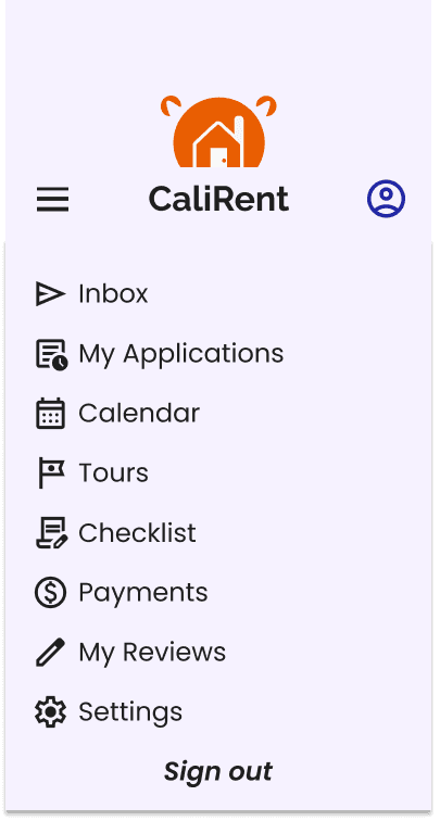
Finally, user flows were the foundation that helped me create a sitemap I'd use to format my product. There were a lot of pages and features that I wanted to include and created a basic site map to help start everything off. There are quite a few things here that I decided to omit from and change in the navigation bar such as the applications page. I decided that page would be best placed under the user icon since it seems like the most intuitive place to put the page.
Creating the blue prints
Time to start building the blueprints! I had a lot of fun at this stage of my project since I could finally put all of my findings, insights, and ideas onto paper.
Low-Fidelity
These low-fidelity wireframes helped give me a good visual representation of my solutions. Again, I focused on the pages that I touched up upon in my user flows, keeping the entry/exit points in mind as well.
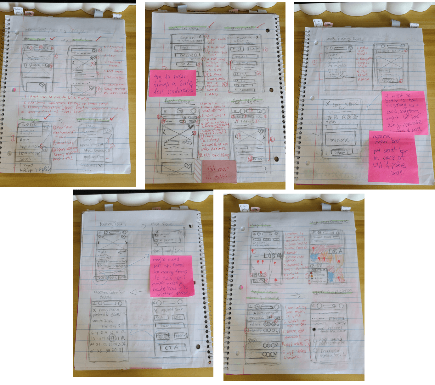
My paper sketches include the main frames I wanted to design later with annotations (in red)

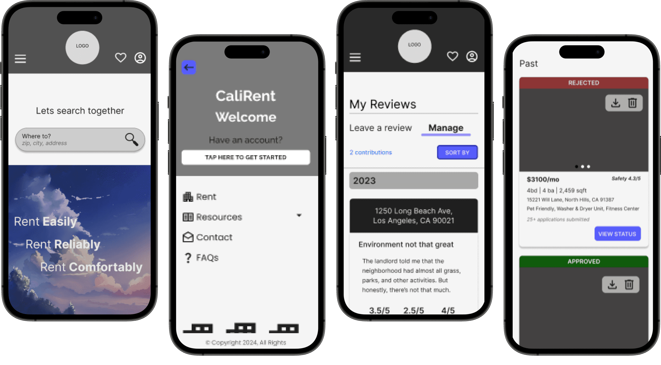
Mid-Fidelity
Now it was time to digitize my sketches into a more cohesive design. I made my mid-fidelity wireframes on Figma as detailed as possible so it would be easier to transfer them into hi-fis, hence the few colors and detailed content.
I initially didn't consider other content on the homepage besides the search bar and listings. I later incorporated more information about my site's services and features to hook in potential users on the landing page, creating a more well-rounded landing page.
Frames include:
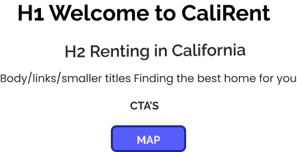
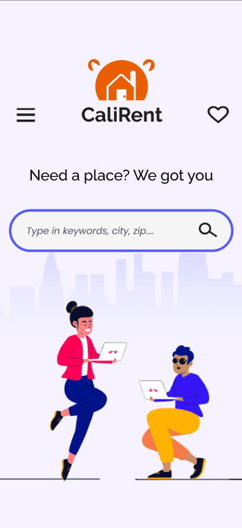
Landing page
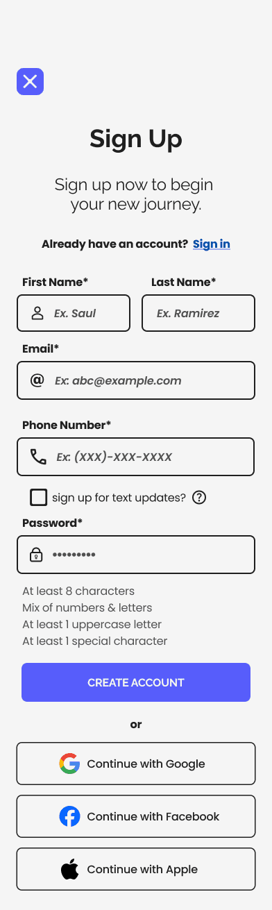
Sign-up/Sign-in page
Navigation menu
Listings page
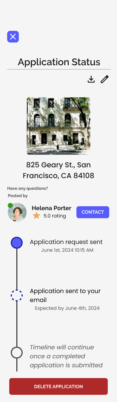
View Application Status page
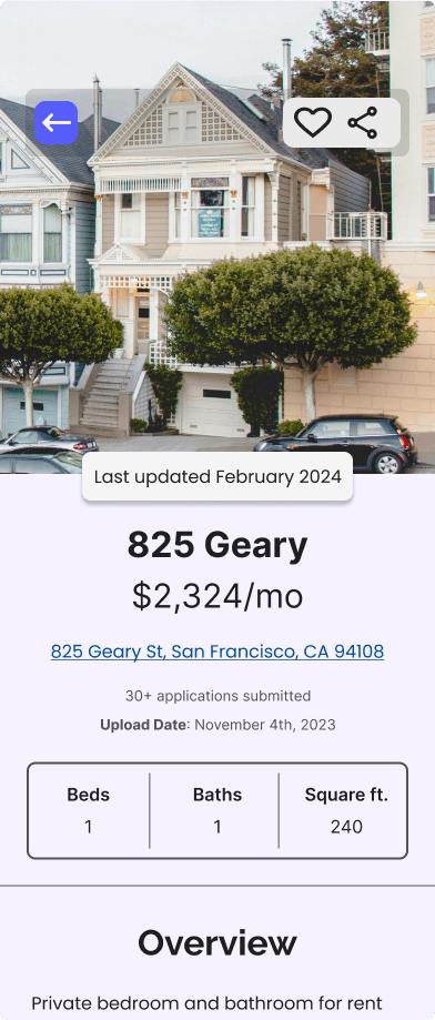
Expanded Listing information modal
Crime statistics
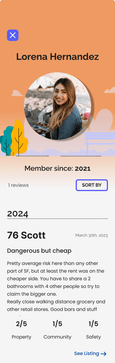
Reviews

Polishing the Design
After I got my mid-fi wireframes to a good spot, covering all the content and frames that I needed, I began to tie everything together. I had to polish up my brand's identity by choosing its theme, colors, and logo. Additionally, I changed the text fonts to be consistent and stylized the frames to match the sites vibe.
Branding
I wanted my site to feel energetic, yet modern. I chose orange as the primary color and made sure to check for accessiblity (it passed!)
"Cali" to show that all the homes available will be in California. "Rent" since it is a renting-only platform.

Early pencil sketches of my logo
Finalized Logo

The California mascot is a bear so the logo is a bears head + ears with a house inside of it. I made variations of it to make sure it worked at different viewports
Color Palette

Typography
High- Fidelity Wiredframes
Once everything was set in place, I applied everything into my mid-fidelity wireframes and transformed them completely into what is now known as CaliRent!


Prototyping & Testing
I recruited particiapants the same way as my user interviews and posted on my Instagram to see if anyone would be willing to participate. With a 5 participants ready, I then tested my three tasks:
Account creation: Can users successfully create an account and is the page layout intuitive?
Find Listing: Will users be able to find their ideal home based on the site's features and will they be deemed as useful?
View application status: Where will users click to find this page and will a service like this be useful?

Users were interviewed afterward with follow-up questions and feedback, and were sent a follow-up survey asking them to rate their experience.
Results & Iterations
Key Results:
100% success rate for task completion
Tasks were completed in 15 minutes or less
Based on the Qualtrics follow-up survey, there was an average of 4.40 for site return, 4.20 for confidence, and 4.60 for east site naviation (out of 5)
Iterations
100% error rate during the "view application" tasks because users intuitively navigated towards the hamburger icon to find this page when it was placed under the user icon.
I changed this layout and moved all of the user icon pages into the hamburger navigation and replaced the user icon with another CTA.

When it came to credibilty, users mentioned how they want the site to be more personable, such as putting a face to the reviews or seeing more information about leasing managers.
I added profile pictures to user reviews and included more information about property managers on the listings themselves.

Additionally, I created user and leasing manager profiles to create a more personable feeling for my website.

Lastly, users had to go an extra step to scroll down to view application statuses. Therefore, I re-formatted the page to prevent extra scrolling and included leasing manager information
Key Takeaways
The biggest lesson I've learned after finishing up this project is to never stick to one idea and that it's okay to change directions.
I was honestly a bit fumbled when I found that my two hypotheses were proven wrong before I even began user interviews. However, it was still a valuable experience to learn how to iterate and move forward while on a time crunch.
There is nothing more valuable than feedback from potential users. I think I got the most important information from interviews that actually helped me bounce back from my fumble.
Feedback from usability testing was also one of the biggest contributors to improving my designs all together. I actually did not think about adding personable touches to the platform to boost credibilty, so hearing this feedback was eye-opening.
Next Steps
We need to conduct more usability testing to see if these iterations benefit the platform and if these iterations boost credibilty and site return. We can stil play around with the user profile layout and see if there is a way to make it cleaner or if there's any other additional information needed.
We also need to update the crime statistics map to be more interactive.